We’ve made it to the tail end of winter, which means spring is right around the corner! It might be hard to picture it now, but soon you’ll be soaking up the sun on your patio, tending your garden and letting the fresh air flow throughout your house. Now’s the perfect time to start thinking about how you’ll refresh your home design and decor to flow with the change in season as well!
Perhaps it’s your furniture that needs the upgrade, or a change in home decor will do the trick. No matter what element of your living space needs reinvention, the easiest way to brighten things up is by using refreshing, seasonal colors. Here are a few to consider, plus ways to incorporate them throughout your home:
Living Coral
Pantone’s 2019 Color of the Year named Living Coral should be on your radar for spring. You can get creative with coral by presenting it in a deconstructed way instead of its full form, as interior designer Carolyn Pressly suggested to Elle Decor.
“We’ll be seeing more hopeful and optimistic colors in the home, as evidenced by the recent selection of living coral, Pantone’s color of the year,” she shared. “Instead of using coral literally, you can separate it into its orange and pink counterparts. In [a] windowless office converted into a little girl’s room, the mood instantly becomes energizing and uplifting.”
This color isn’t limited to a children’s bedroom, however. Consider using it to liven up the entryway or freshen up a guest bathroom.
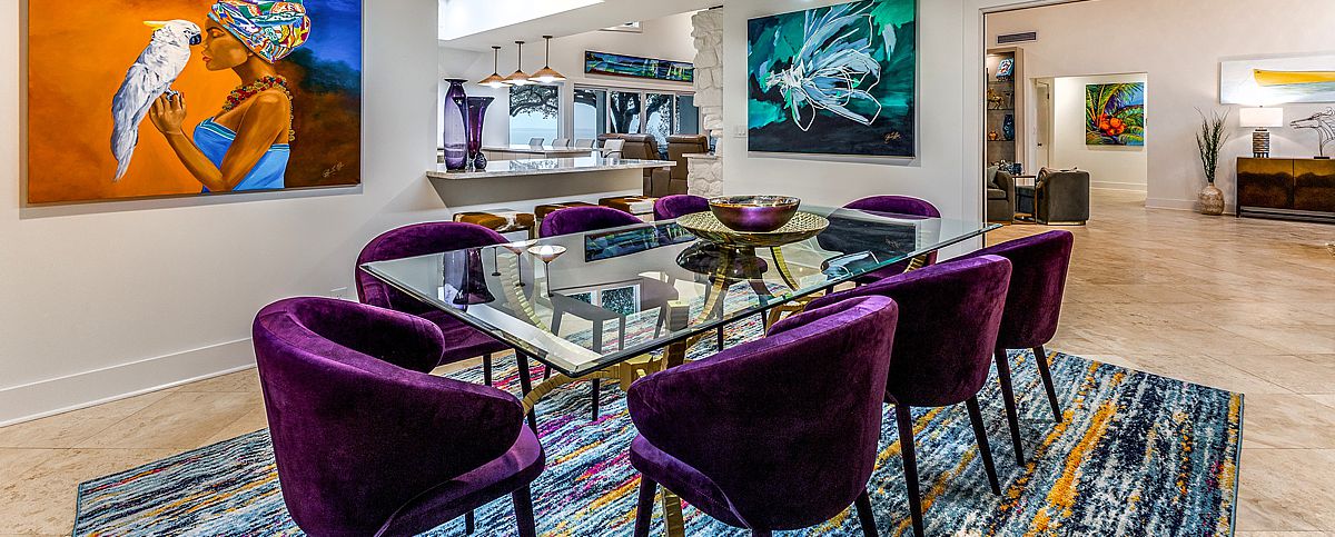
 Muted purple can make a bold statement.
Muted purple
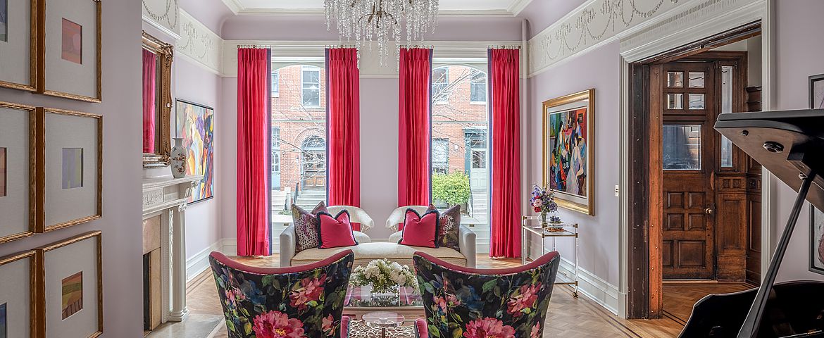
Ultra Violet, last year’s Pantone Color of the Year, is still a trendy hue that can be used throughout the home this spring. A darker take on the usual pastel purple expected for spring, this shade evokes positive energy in a room that needs a revamp. This is gorgeous hue for the master bedroom, or even in the living room with throw pillows and blankets.
Misty blue
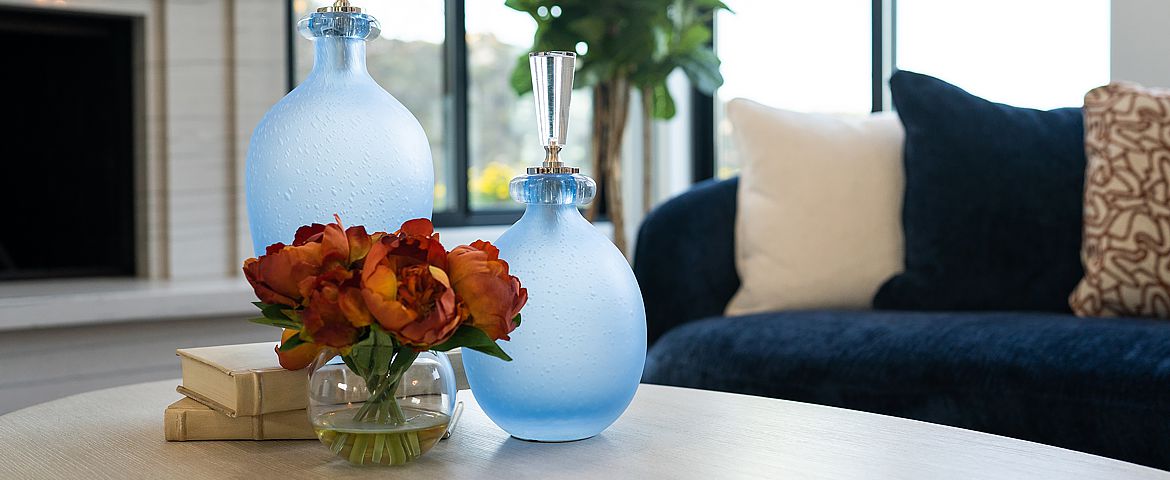
Soft blue with rich gray and purple undertones is a color to consider this spring. It’s another hue that’s on the muted side that can make a room feel more full and comforting. Misty blue can be placed throughout the house for a flow of energy; consider it for the kitchen walls or in home office accents.
Honey
If yellow is the color you usually incorporate to brighten up a space, stay away from the bold, classic primary shade and take a softer approach. Mark Woodman, designer and president of the Color Marketing Group, told Better Homes & Gardens magazine to decorate with honey hues to evoke a refreshing feeling similar to the outdoors.
“Try soft honey tones instead of Tuscan yellow; they feel lighter and can be spiced up a little to almost a honey-Dijon color. These hues connote a sense of wellness, nature, and nurture,” he shared.
Changing your color scheme can be intimidating, especially if you’ve used the same patterns and hues for decades. If you want to mix things up for spring but you’re not sure how to get started, contact a personal decorator from Decorating Den Interiors. He or she will come to your home for a free consultation to go over your ideas and provide professional insight based on your personal preferences and the allotted space. From there, you can start planning which colors will work best throughout your living arrangement based on the spring look you want to achieve.
The season change is coming! Contact a design consultant from Decorating Den Interiors today.

