Reading time 9 minutes
Picking the Perfect Interior Design Color Palette
Your home is a blank canvas, and you’re the artist ready to get to work. However, staring at an empty space can feel extremely daunting, especially if you don’t know where to begin.
Before grabbing a paintbrush and making the first strokes, ask yourself this question: How will the selected colors serve me and my space? While this query is a bit lofty, it should get your wheels turning. Have you thought through the what, why and how of your selected shades? If not, you’re not quite ready to put brush to wall yet.
An interior design color palette is a curated, cohesive group of hues used for your walls, furniture and decor. The purpose is to have these colors work together to lay a foundation for consistency, balance and flow. And because color impacts mood, cohesion and perceived space, the selection process shouldn’t be taken lightly.
This guide will help you navigate what color palettes are, why they matter and how to choose one for your home. So, grab your brush and easel and prepare to create a masterpiece.
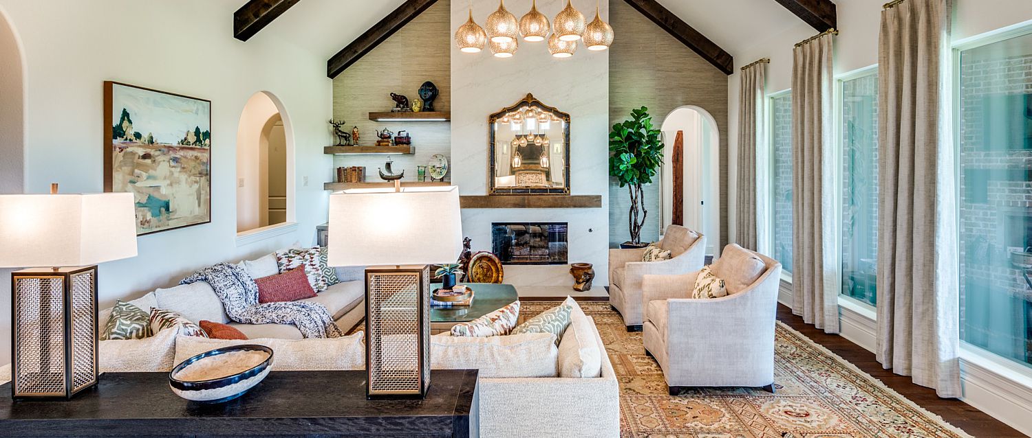
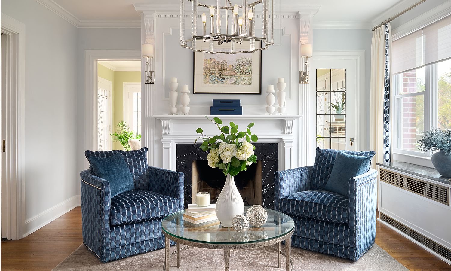
Interior design colors matter to your space. Pick the best shades with our guidance.
Color Palettes Are the Foundation of Great Interior Design
Color palettes are a curated selection of shades used consistently throughout a space. They typically include the following types of colors:
Dominant color: The primary color that takes up the largest surface area. It sets the overall tone and mood of the space. For example, a soft, warm white creates an airy, calm environment, while a deep navy establishes drama and sophistication.
Secondary color: The next-most-used color that supports and complements the dominant shade. It’s often used in upholstery, rugs, window treatment and cabinetry. This hue adds depth and contrast without overpowering the room. Think of it as the sidekick that helps the primary color win.
Accent color: The rare shade that’s used sparingly to create visual interest and personality. These appear in decorative elements like pillows, wall art, vases or statement chairs. Accent colors can be bold and unexpected and are the finishing touch that brings energy and dimension forward.
Follow the 60-30-10 rule and use three to five colors throughout your home.
These collections help deliver your design wishes by working magic in several ways:
Creating Visual Cohesion
By using the 60-30-10 rule or a similar tactic, you’ll keep the space balanced and ensure each room flows naturally into the next. Try combining 60% of a dominant color, 30% of a complementary secondary color and 10% as an accent to create natural balance.
Preventing Rooms From Feeling Chaotic
Sticking to an interior design color palette reduces clashing shades and helps your home appear harmonious and visually appealing. If you have a ton of different hues that don’t necessarily complement each other, it can have the opposite effect and look disorderly.
Influencing Mood and Energy
In interior design, color psychology examines how people interact and respond to certain tints. For instance, warm colors like red, orange and yellow often bring people joy, warmth and energy. On the other hand, cool colors like blue, green and white deliver stability, calm and peace. By picking shades that emulate the types of feelings you want to experience in your home, you’ll have an instant mood lift every time you walk through the front door.
Making Decorating Decisions Easier
You have every decor option available to you as you set up your house. It’s kind of a lot, isn’t it? When you secure a particular interior color scheme, it can narrow your focus and make decorating less complicated.
Helping Define a Specific Decor Style
Color palettes can be flexible depending on the type of aesthetic you want to achieve. However, some shades lend themselves to certain designs better than others. Finding the colors you like can help you pinpoint your home’s interior style, making it easier to create a cohesive finish.
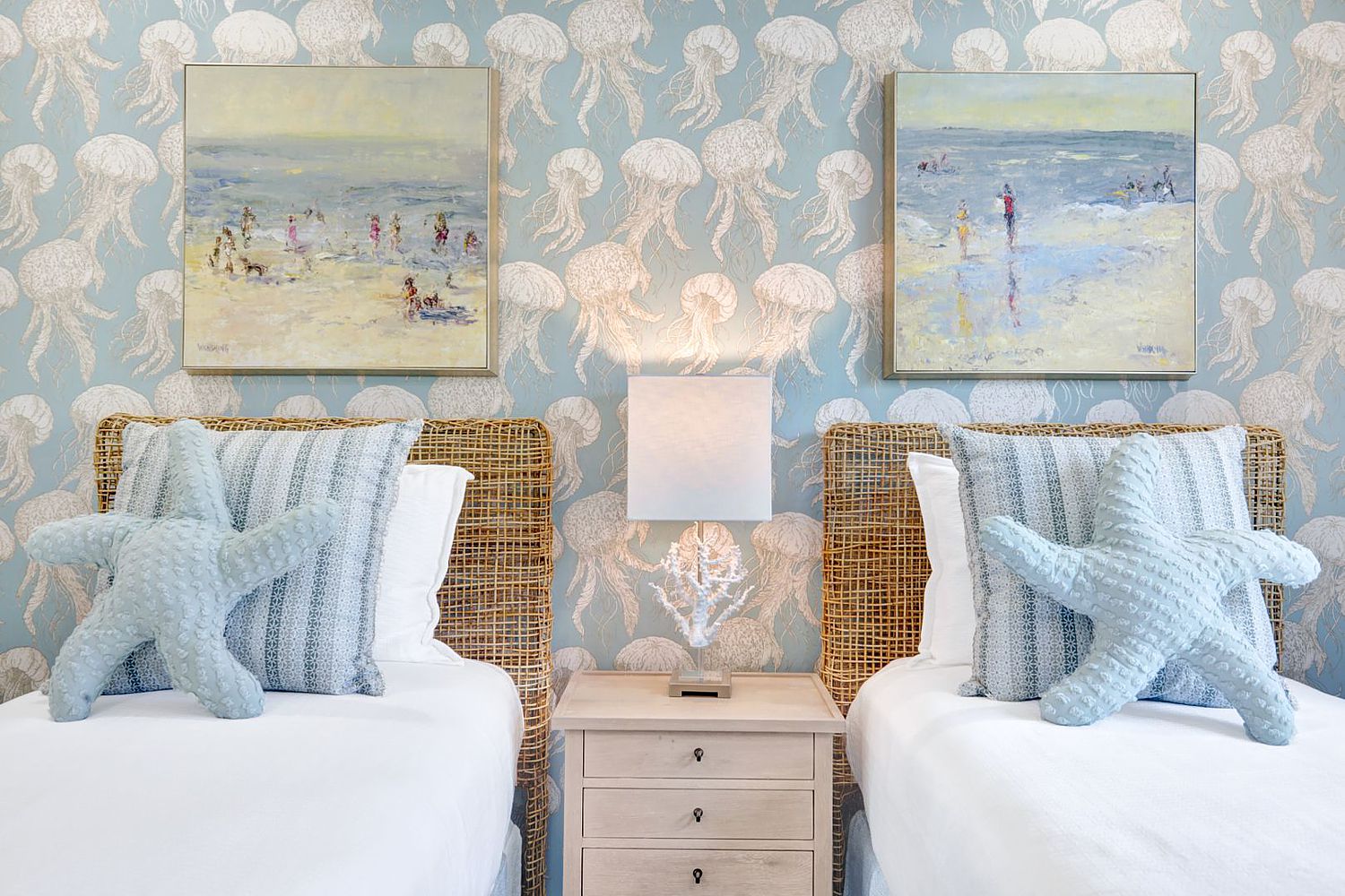
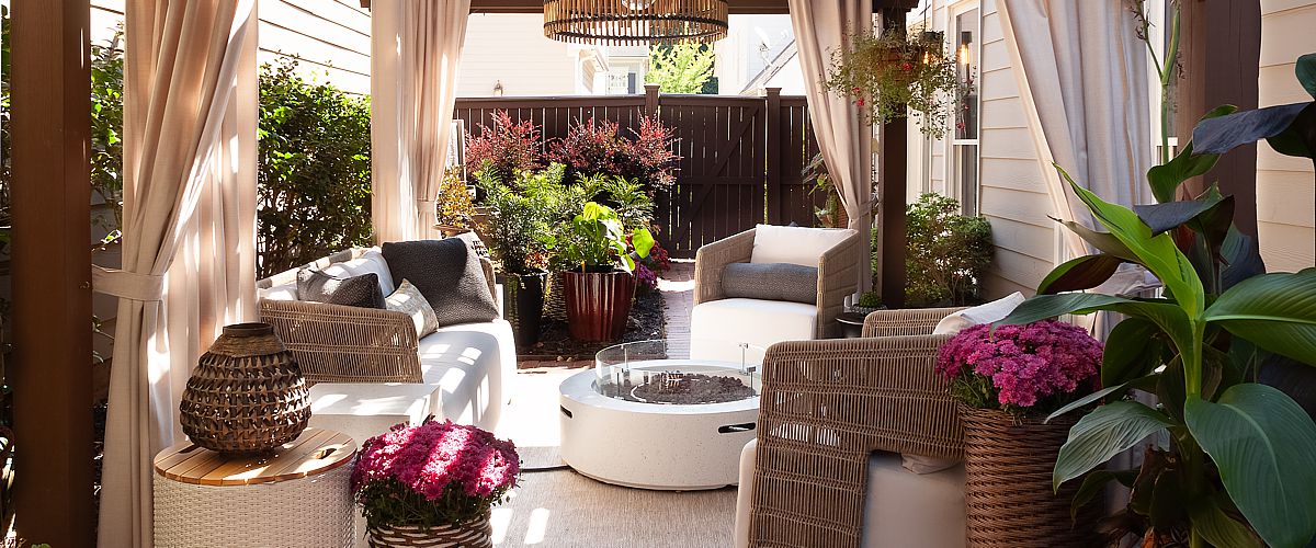
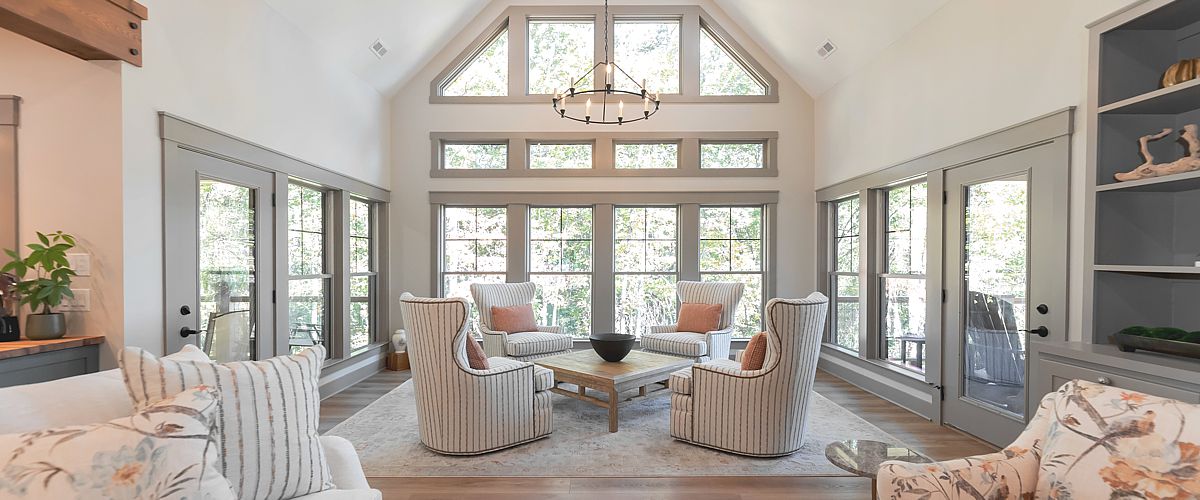
Organic shades and beachy tints appear visually calming and peaceful.
Learning From the Pros: Strategies for Choosing Color Schemes
Want to think like a professional decorator? Our team is always working one step ahead to paint the perfect picture for each and every client. Here’s how they do it:
Designers Start With Fixed Elements in the Room
Rather than reinventing the wheel, the pros look at what’s already in your space to determine which direction to go. If you’re switching up everything entirely, then this isn’t the best method. But if any elements are remaining the same, these fixed points can lay the foundation for all other color-related elements.
This includes any of the following characteristics in your home:
- Flooring.
- Cabinetry.
- Countertops.
- Architectural features.
- Upholstery.
Designers Consider Lighting and Undertones
Designers never take a home at face value — they always take things one step further to ensure all design touches work together in your space. This includes what types of lighting you commonly use, whether your home gets drenched in natural light, what undertones already exist and how the colors will shift throughout the day as the sun changes. They pay attention to which rooms get the most direct light and determine the color blend based on what will look the best 24/7, 365 days a year.
Designers Define the Desired Mood Before Selecting Shades
Designers always look into color psychology before selecting a scheme. Let’s say you want an organic space that feels refreshing. Your designer would probably select a palette with lots of greens and earth tones. Or, if you want each room to look elegant, chic and ultra timeless, black and white are the clear hues to choose. Pros know how you’ll respond to specific shades and use that knowledge to hand-pick the perfect lineup.
Designers Limit the Palette To Maintain Balance
Professional decorators aren’t afraid to go big and bold, but they also know when to dial it in. Wondering how many colors should be in a palette? Designers always select around three to five main colors to mix and match in a home, keeping things simple rather than throwing every color of the rainbow on the walls and decor.
Pro tip: Don’t be afraid to have fun with variations in tone and shade. Doing so creates depth and can introduce diversity without adding another hue to the mix.
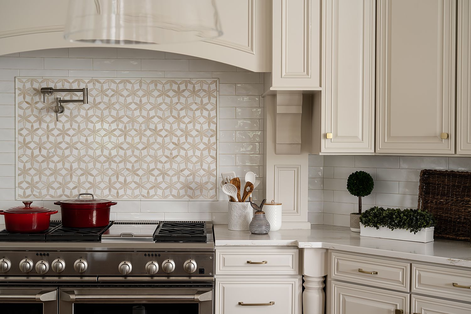
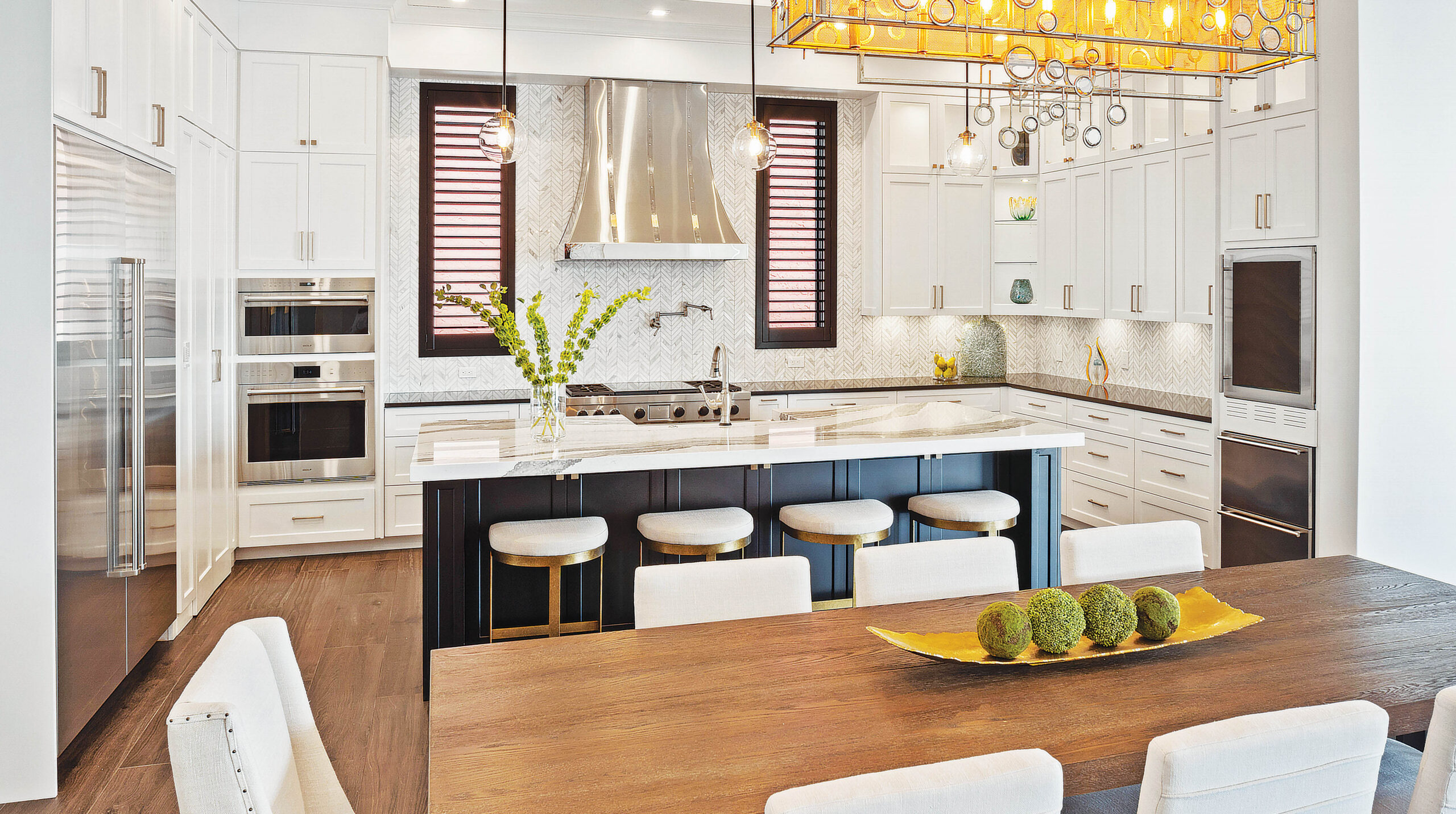
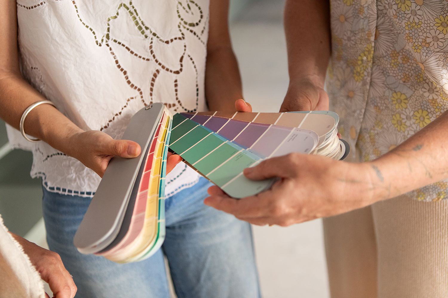
Interior design colors matter to your space. Pick the best shades with our guidance.
Steps for Choosing Your Home’s Color Scheme
So, what does this look like in practice? Follow these steps for a palette that suits your personal design style and desired ambience:
- Identify your home’s architectural style: Pinpointing which category your home fits into can lend a hand in color selection. Do you have an uber-modern loft? Deep neutrals and cool tones would work wonders. Have a funky architectural focal point you want to highlight? Stack dominant colors in that area to show it off. Every home is different, meaning it pays to tailor the color scheme to your specific space.
- Determine the mood you want each room to convey: Are you looking for a highbrow hideout or a super sunny spot to puzzle and read? Knowing how and what you want to feel when you come home helps you pick paint colors. For instance, a burnt orange bathroom will jolt you awake in the morning before work, whereas a lavender one will help you feel like royalty or an all-white moment will emulate feelings of peace.
- Pull inspiration from anchoring pieces: Which pieces would you say are the foundation of your home? White oak flooring, creamy white countertops or dark mahogany cabinets can all inform your color direction and make certain your selected shades pair nicely with your existing home. This is also your chance to notice any irregularities that may need to be fixed throughout your space, including different-colored hardware or mismatched wood tones.
- Test paint samples in real lighting: Colors look a lot different at the store versus in your actual house. If you’ve ever confidently purchased a can, brought it home and started painting, only to be shocked at the shade, you’re already well-aware of this fact. It’s helpful to take home paint samples you’re considering and test them in various lighting. Does one room get a particularly high amount of natural light? Hang the swatch up to see what it does to the hue. This ensures you love the color palette at all times of the day (and night).
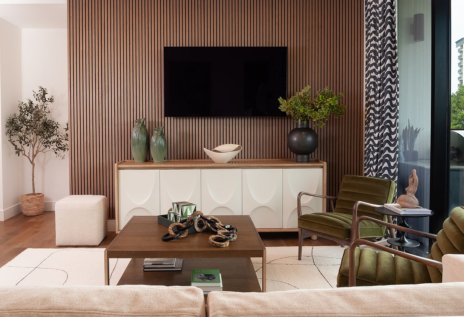
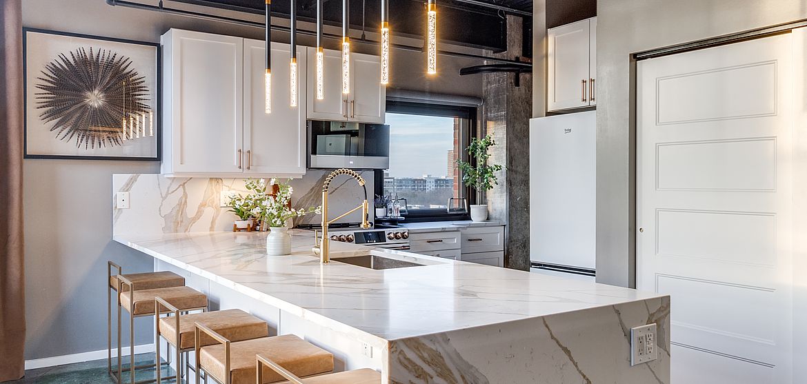
It’s always great to get inspired by trending palettes.
Trending Color Palettes To Test in Your Space
Whether you love the classics like white, gray, cream, tan and taupe or are open to any shade on the color wheel, it’s always great to get inspired by trending palettes. You don’t have to fully redo your space — unless that’s the goal; just introduce a few tints that might work alongside your existing color collection. Or, go all out by selecting one of these top color combinations:
| Palm Springs Modern Palette Mustard. Teal. Blush. Olive. Warm whites. |
Relaxed Coastal Palette Soft blues. Sandy beige. Crisp white. Driftwood gray. Sea salt green. |
|
 |
||
| Moody Jewel Tones Emerald. Sapphire. Burgundy. Plum. |
Earthy, Nature-Inspired Clay. Sage. Mushroom. Warm taupe. |
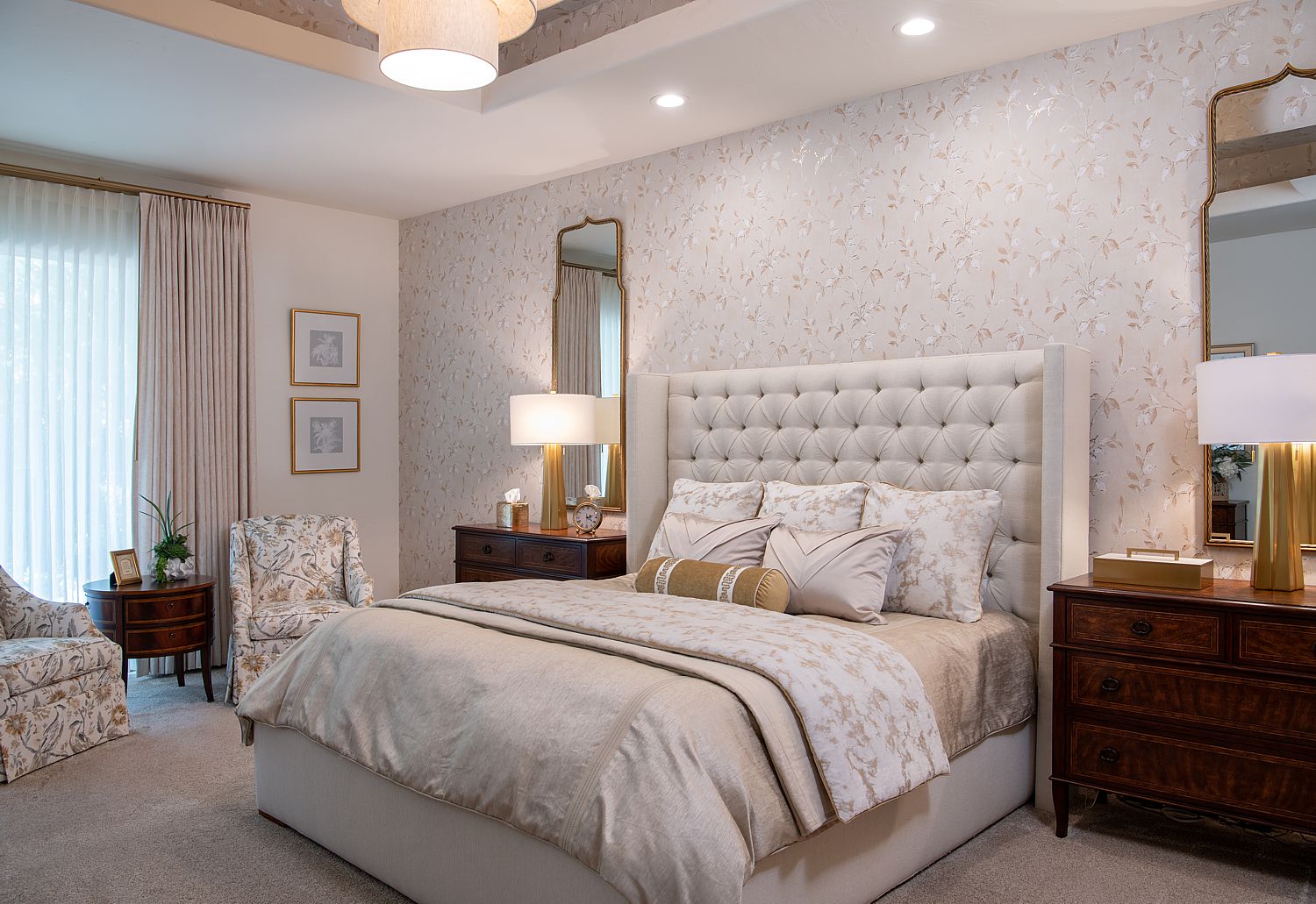
Be super on-trend by incorporating one of the colors of the year, either Cloud Dancer from Pantone or Sherwin-Williams’ Universal Khaki. These beautiful neutral colors are both timeless and timely, perfect if you’re a lover of muted tones.
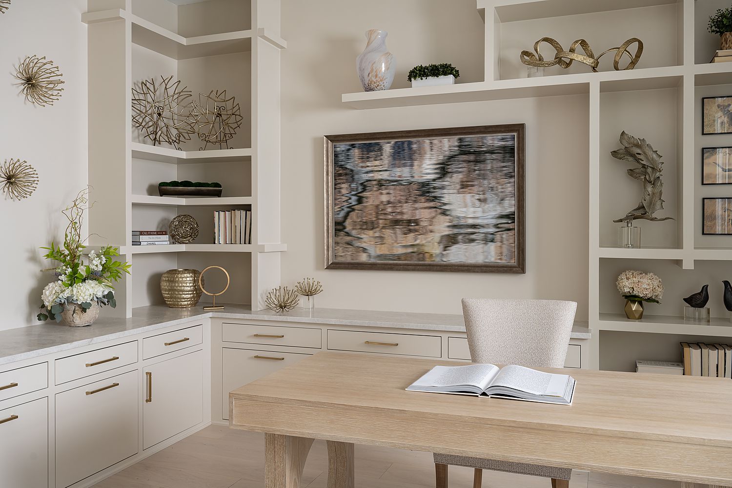
Sherwin Williams Universal Khaki is a great color for the foundation of your space.
Painting Your Perfect Palette
Leaning toward a nice sage green or want to try a lively bold color? Just remember, picking the right color collection for your home starts with:
- Following the 60-30-10 rule and only using three to five colors throughout your home.
- Testing all the colors in different lights, especially for south-facing rooms.
- Picking colors that are harmonious rather than just trendy (bonus points if they’re both).
If this task sounds daunting, Decorating Den Interiors can help! Suzanne Christie has years of experience analyzing and picking the perfect colors for clients, no matter what the style or desired end result. If you’re looking for your home’s ideal color combos, call us today!
Contact Suzanne Christie or call (727) 572-9574
Join Our Newsletter
If you enjoyed reading this interior design blog, sign up for our monthly newsletter. They’re never too long and will brighten your day!